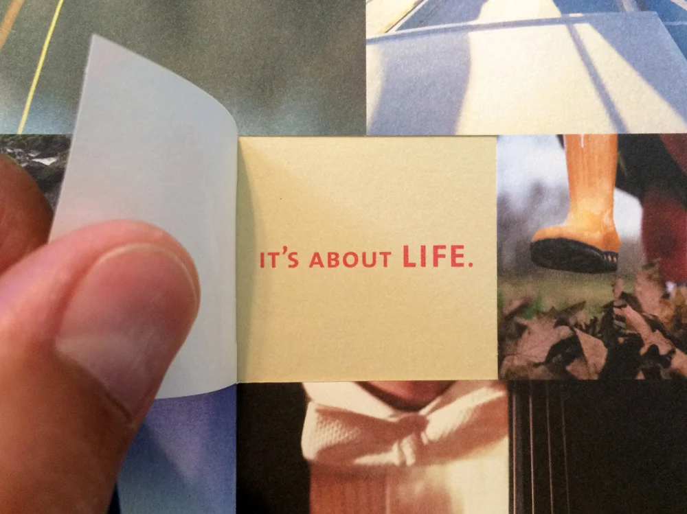
On the heels of rebranding the hearing device company Starkey, its sister company Audibel needed to revamp its own look. While Starkey was a B2B brand focused on technology, Audibel needed to target its loyal partners – or dispensers – and their consumers at an emotional level. For many consumers, buying a hearing device is a sensitive decision. That meant the brand needed to be compelling, yet, approachable.
The system includes soft, rounded corners to mimic sound waves. Neutral colors and orange accents warm the communications. But photography was key. It helped to highlight all of the subtle sounds in life most people with hearing problems aren’t able to experience – from a soft whisper to an orchestra in a concert hall and everything in between.
The redesigned logo included a bell, which – in itself – suggests sound. The drawing of the symbol also echoes sound waves. The green is bright, yet, comforting.
Responsibilities: Creative lead, concept development, visual system, photo library, print collateral, launch materials, packaging & stationery


