Blue Cross and Blue Shield of Minnesota was on the heels of launching a new plan targeting a younger demographic. The marketing team was struggling to develop materials using their existing system, which was dated and corporate-looking. Specifically, the designers were struggling with the primary blue color, which was dark, heavy and unattractive when tinted.
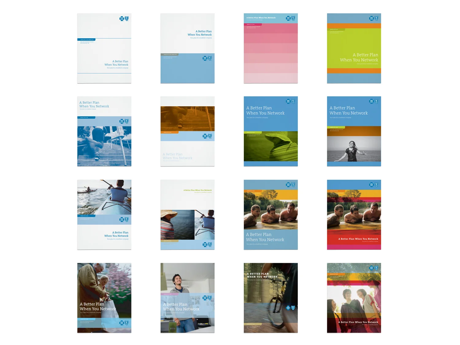
The solution was to remain “blue” through a palette of blue tones, complemented with a palette of vibrant and neutral colors. The primary blue was reserved for the logo and headlines. A grid of seven horizontal bands was used as a framework, which allowed flexibility in digital and print media.
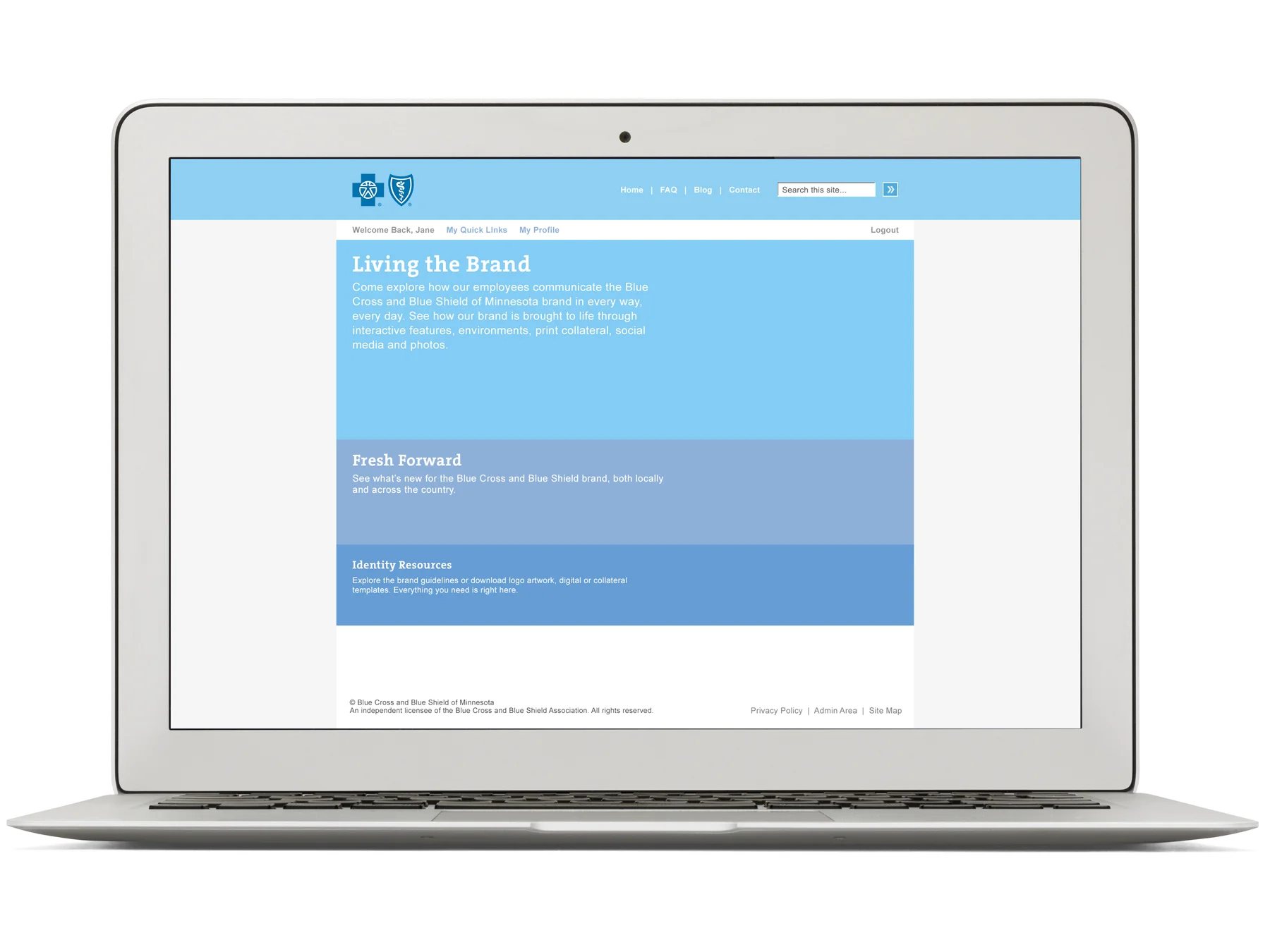
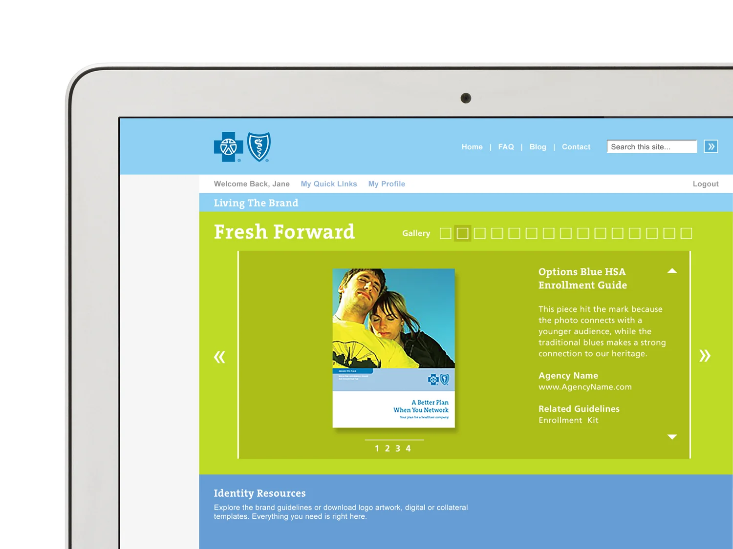
An online brand center was developed as a resource for logo art, templates and guidelines. The Fresh Forward module is a gallery and a source of inspiration for internal and external audiences.
Responsibilities: Creative lead, concept development, visual system, digital, print collateral & guidelines


